Jimi Hendrix × Chronicle Books
JIMI is the ultimate tribute to the greatest guitar player in rock and roll history, celebrating what would have been Jimi Hendrix’s 80th birthday on November 27, 2022. This comprehensive visual celebration is an official collaboration with Jimi’s sister, Janie Hendrix, and John McDermott of Experience Hendrix L.L.C. JIMI significantly expands on the authors’ previously published titles, including An Illustrated Experience, and features a new introduction by Janie, extensive biographical-texts, and trove of lesser-known and never-before-published photographs, personal memorabilia, lyrics, and more. Additionally, JIMI includes quotations by legendary musicians, such as Paul McCartney, Ron Wood, Jeff Beck, Lenny Kravitz, Drake, Dave Grohl, and others who have spoken about Hendrix’s lasting influence. 

In the four years before his untimely death at age 27, Jimi Hendrix created a groundbreaking musical legacy, one that includes revered classics such as “Purple Haze” and “Voodoo Child.” His signature guitar playing, provocative songwriting, and charismatic performances have continued to inspire legions of musicians and fans alike. 

Photo of Jimi Hendrix (Wikimedia Commons)
The Cover
The “JIMI” wordmark on the front cover of the book was based on the lettering from a 1960s concert poster designed by Hapshash and the Coloured Coat. They were an influential British graphic design and avant-garde musical partnership in the late 1960s, consisting of Michael English and Nigel Waymouth. They produced popular psychedelic posters and two albums of underground music. ¶ The silkscreen printed posters created by the pair advertised underground "happenings," clubs, and concerts in London and became so popular at the time that they helped launch the commercial sale of posters as art. ¶ Their posters remain highly sought after. The original artwork for a poster advertising Jimi Hendrix's 1967 concert at the Fillmore Auditorium in San Francisco – depicting the guitarist as a psychedelic Native American chief with a hunting bow in one hand and a peace pipe in the other – was sold in 2008 by Bonhams for $72,000. (Source) 

Getty Images

I came across this high-value poster when searching on Etsy one day, and I immediately knew that it had to be on the cover. However, instead of simply retracing the lettering piece, some refinements had to be made. ¶ I started out by refining some of the larger shapes and synchronizing the curves. For example, the dot on the ‘i’ was removed from the ‘J,’ resulting in the round negative space. From there, the heart in the ‘M’ was significantly scaled up to match the size of the dots on the ‘i’s. Once that was done, I wanted to make sure that all of the letters fit together like a finished puzzle. 

Once the wordmark was finished, it was time to find the perfect photo to pair with it. However, with a pretty tight deadline of 4 months, the design of the interiors had to enforce the cover. So, as I'm designing the interiors and working with Steve Crist of Chronicle Chroma on finding images for the cover, we came to the realization that it won't be possible to take someone else's image and slap it on the cover. We needed to find a photographer that would not only allow us to use their image but, more importantly, allow us to edit it without their input. ¶ Once Steve found the perfect photo, now it was my time to make it and the wordmark shine. ¶ I explored everything from halftone effects to distortions that felt like they were made by Jimi's


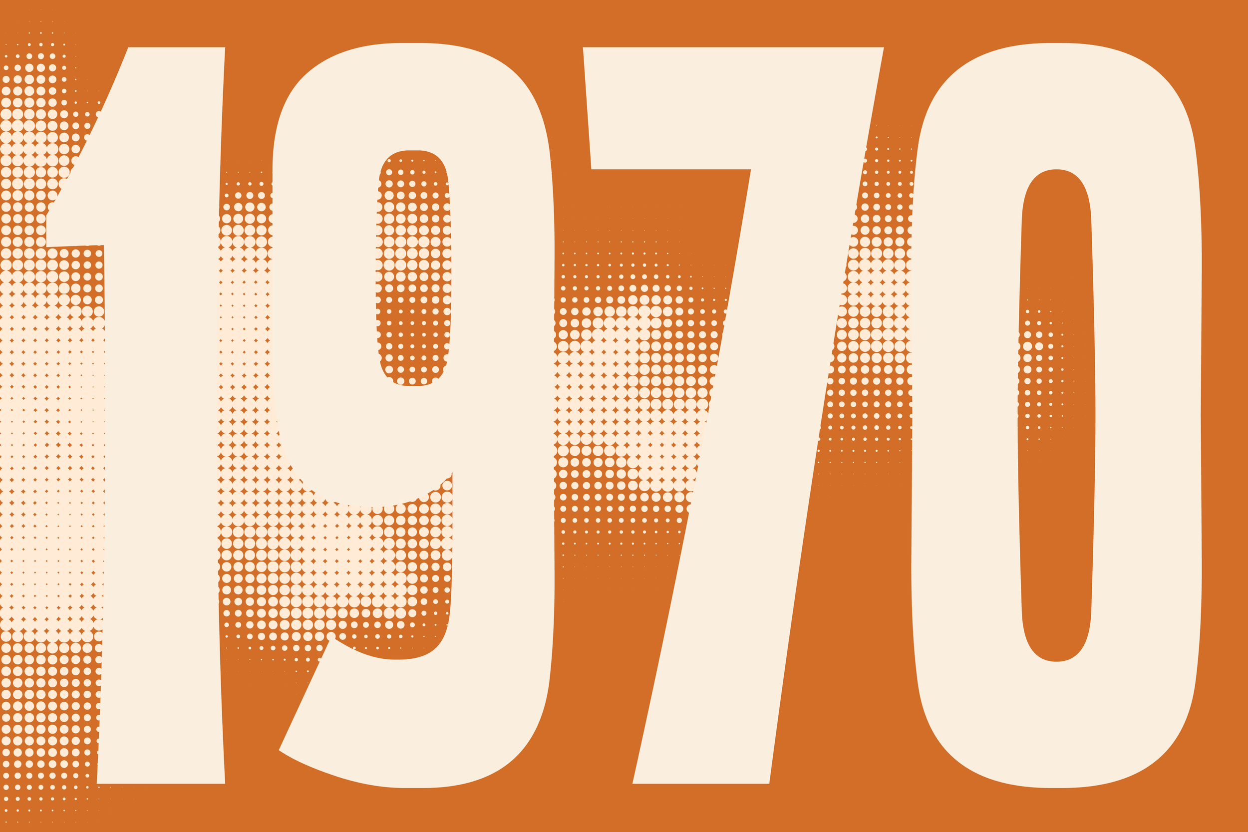
Chapter Title Spreads
When I started designing these spreads, all I could think about was Purple Haze and this one phrase, “Excuse me while I kiss the sky.” It's that song that inspired the inside covers (which are covered in blue skies and halftone clouds), and these spreads. Call it haze, smoke, or clouds, 


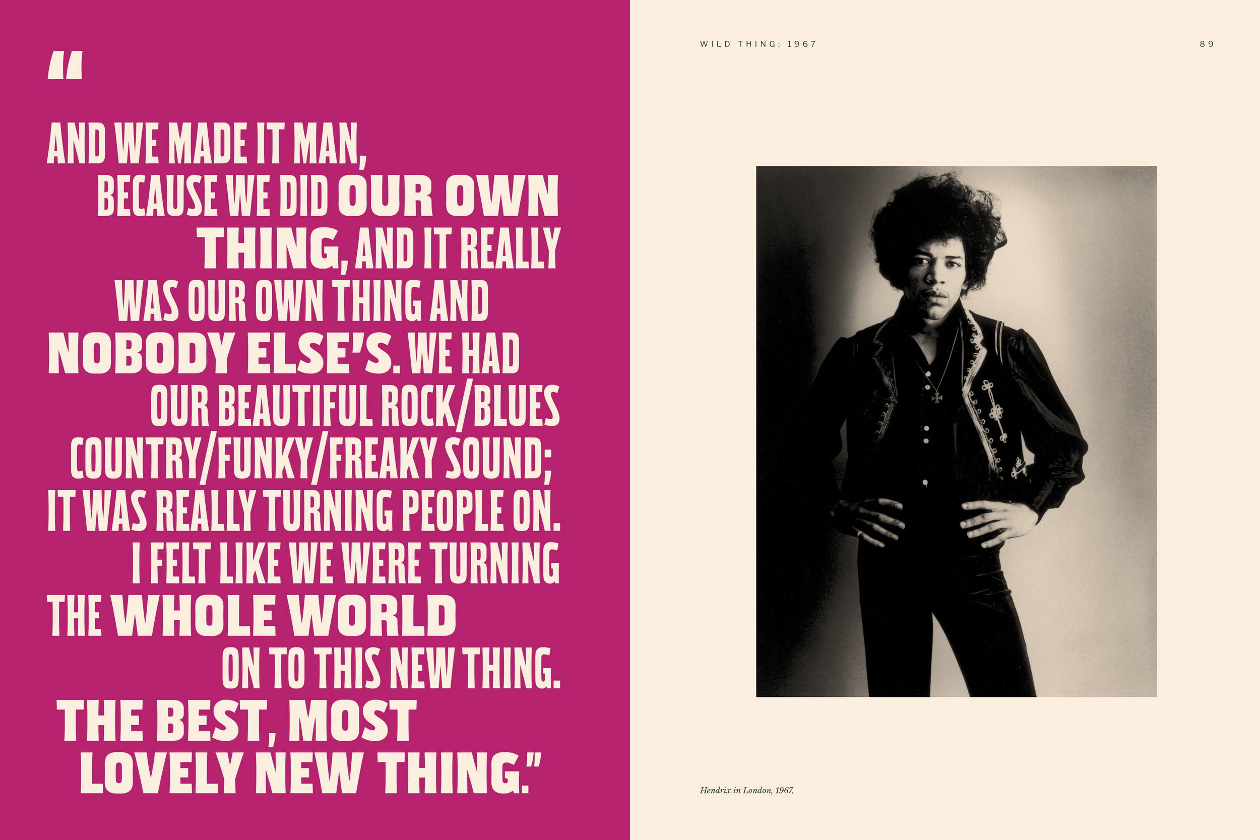
Quote Spreads
It's important to note that Jimi, despite his on-stage persona, those who knew Hendrix described him as a reserved, laid-back man prone to bouts of shyness. With this understanding, it's equally important to note that Jimi hated the psychedelic aesthetic, just as much as he hated all of his album covers. [2] He hated his covers so much, that he actually sketched out (he was actually a great illustrator since childhood) and art directed a photoshoot for the album Electric Ladyland. Unfortunately, the record label rejected the cover he designed and went with something that aligned with his perceived persona. ¶ However, it was this album cover that inspired most of the pages within this book. We (Steve and I) decided to treat the cover as the persona, while the interiors had more of a soft-spoken, scrapbook aesthetic. 


VTC Jimi Display
For use on chapter titles and oversized quotes, VTC Jimi Display was crafted. Consisting of two weights, this headline family is based on vintage wood type. Kind of like what one might find on old concert posters. However, while the type does fit the era of Jimi, I was more so drawn to the references as they reminded me of bell-bottoms and oversized sleeves—the essence of 70's fashion. 


Introductory Spreads
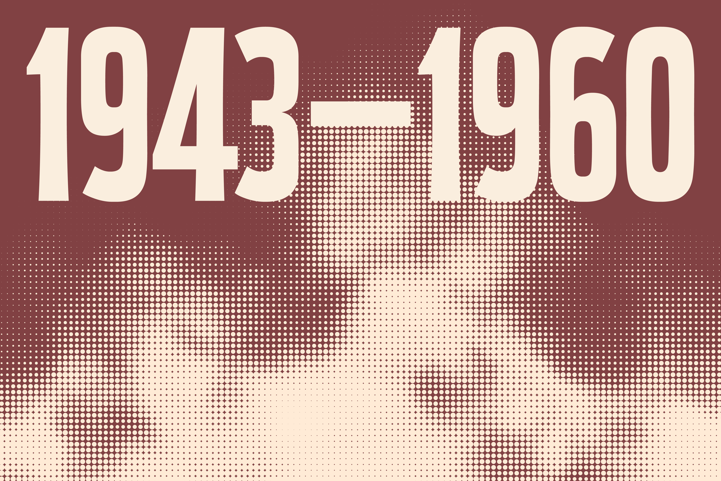
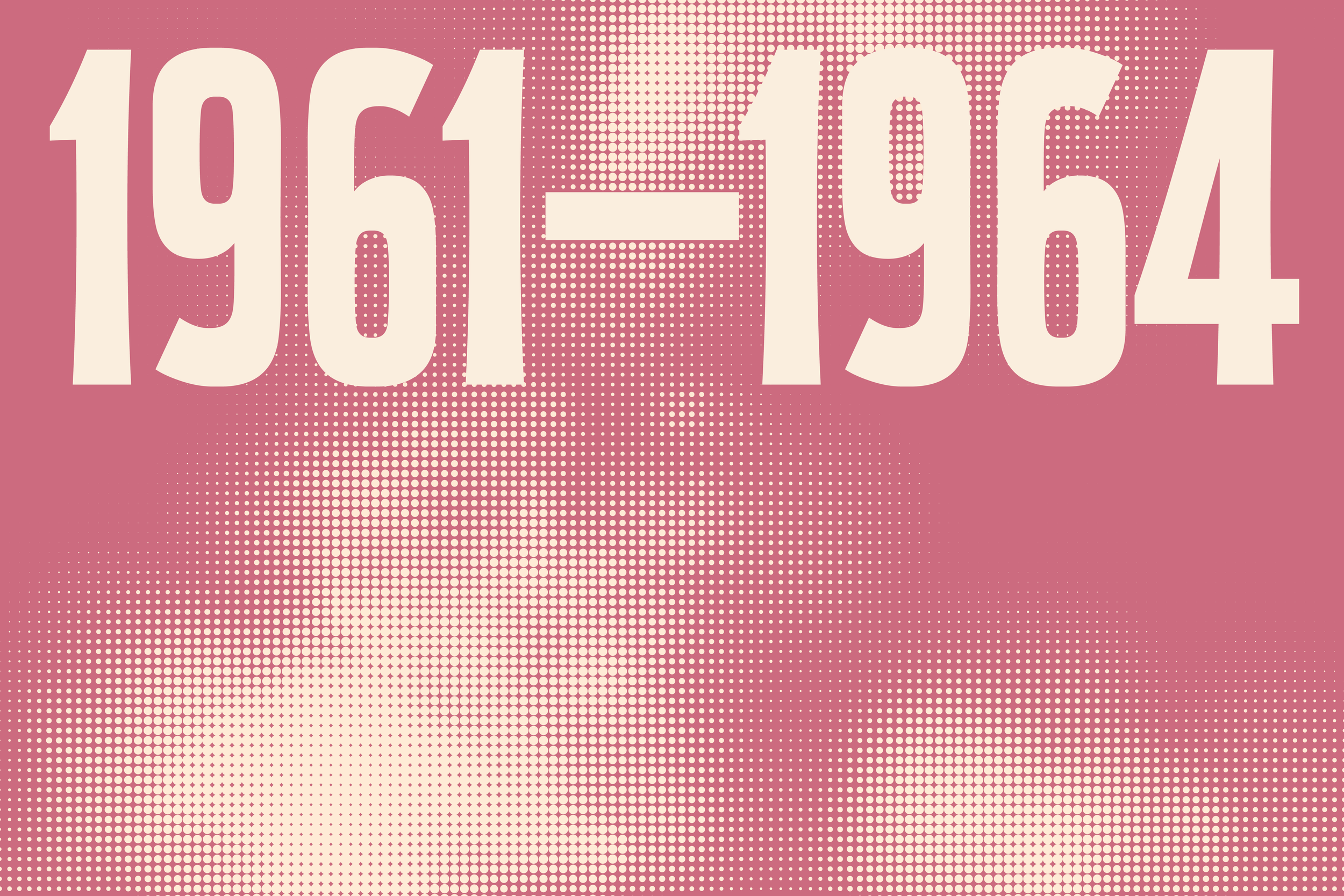
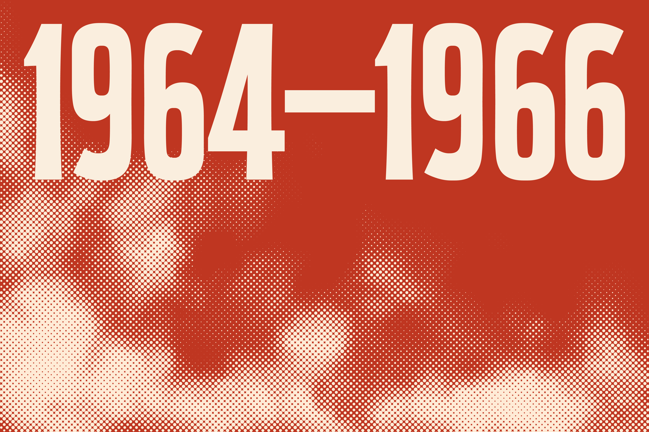
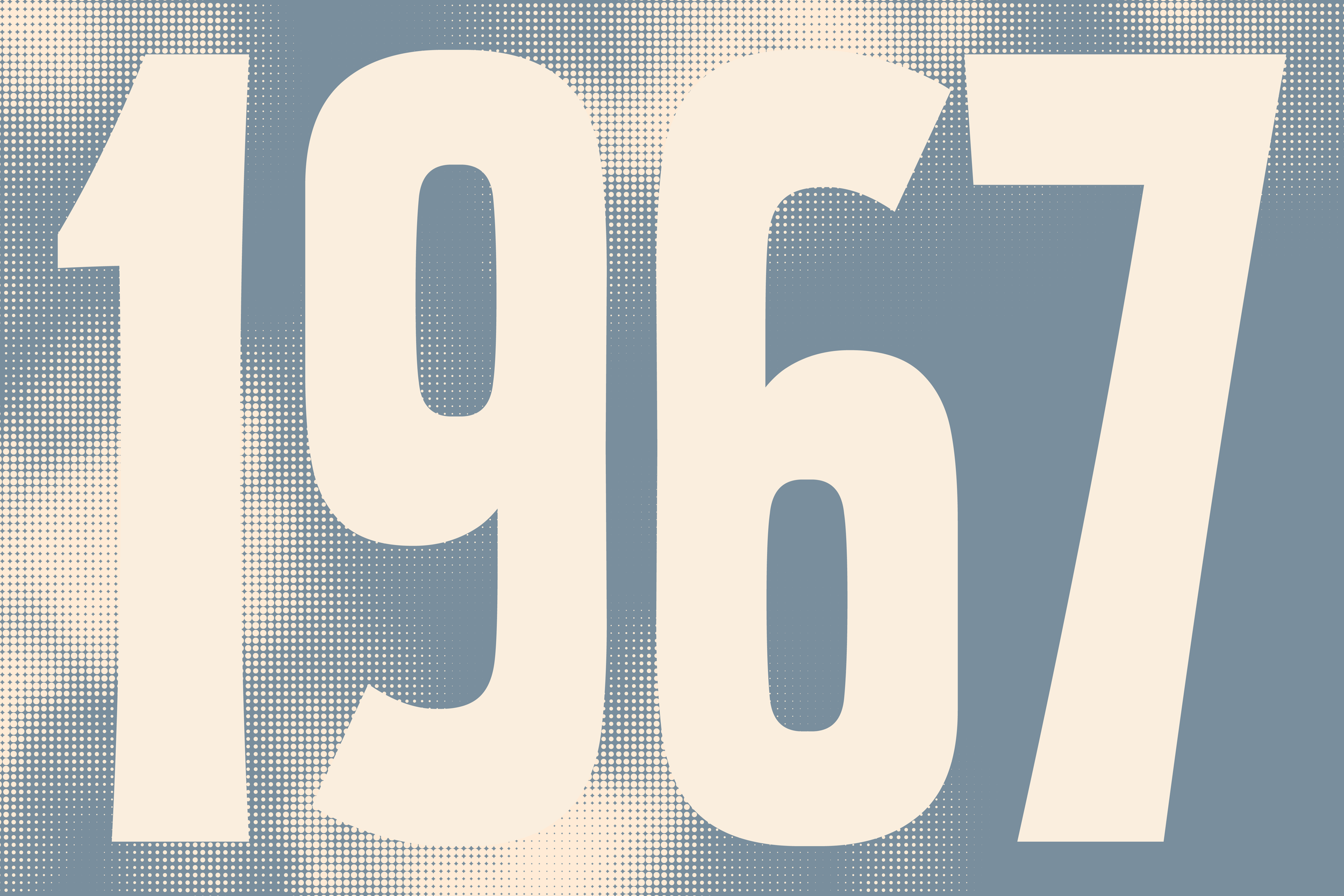
While the chapter titles are simply years within Jimi's life, these introductory spreads are what truly broadcast the chapter's contents. Each title is set in a combination of VTC Jimi Display Regular and Bold, followed by a few short paragraphs. ¶ Designed by Parasol Projects, the space featured the logo from the sport collection on the walls, windows, checkout counters and more. 


Jimi Hendrix, beyond being a legendary musician, was also a pretty great illustrator. Because of this, a series of doodles were created based on ones he drew in personal letters to family and friends. These doodles were placed throughout the book.


A Scrapbook for Jimi
We wanted this book to feel like the scrapbook Janie Hendrix assembled for her brother with the help of John McDermott. Because of this, there are only three consistent spread layouts throughout the book. Beyond those introductory spreads, no two pages are alike.


VTC Jimi Text
For use on chapter titles and oversized quotes, VTC Jimi Display was crafted. Consisting of two weights, this headline family is based on vintage wood type. Kind of like what one might find on old concert posters. However, while the type does fit the era of Jimi, I was more so drawn to the references as they reminded me of bell-bottoms and oversized sleeves—the essence of 70's fashion. 


While they’re not noticeable as you’re reading, I’ve incorporated one of Jimi’s guitar picks into the terminals of every character and the dots of the punctuation marks.


-
Partner(s)
Creative Director: Jack Carlson
Brand Director: Karl Blanchard
Art Director: Georgia Gray
Photographer: Lucas Creighton
Stylist: Tinbete Whut
HMU: Allie J -
Timeline
Start: 08.2021
End: 10.2021
Launch: 08.2022 -
Service(s)
Fashion
Identity
Typography -
Note(s)
N/A