Spike Lee × Chronicle Books
Spike Lee is a world-renowned, Academy Award-winning filmmaker, a cultural icon, and one of the most prominent voices on race and racism for over three decades. His prolific career has included over 35 films, including his directorial debut She’s Gotta Have It (1986), his seminal masterpiece Do the Right Thing (1989), and more recently, his Oscar-winning film BlacKkKlansman (2018). Spike Lee’s provocative feature films, documentaries, commercials, and music videos have shone the spotlight on significant stories and made an indelible mark in cinematic history and contemporary society. 

Featuring hundreds of never-before-seen photographs by David Lee, Spike’s brother and long-time still photographer, SPIKE the book includes behind-the-scenes, insider images that underscore his creative process and his significant impact on the culture at large. From his critically acclaimed film Malcolm X (1992), starring Denzel Washington, to his recent film Da 5 Bloods (2020), featuring the late Chadwick Boseman, Spike Lee’s work continues to resonate now more than ever. Also included here are his beloved commercials with Michael Jordan for Nike, which helped launch the billion-dollar Jordan brand product empire, as well as his music videos with Prince and Michael Jackson. This is a must-have collector’s item and ideal gift for any cinephile and fan of one of the most prominent and influential filmmakers in history. 

The Covers
Because this is the cover, the part of the book that people do, in fact, judge despite any antiquated quotes, I decided to design the cover based on Spike’s fashion sense and those of his characters. From the large gold jewelry he wore (as a character) and several of his co-stars to his ceremonial suits that grab more attention than the award-show winners. ¶ The first cover I designed was purple, inspired by the amazing purple suit and the gold “LOVE” and “HATE” rings he wore at the Oscars in 2019. ¶ However, Spike asked that we change the color to fuchsia, as that was his mom’s favorite color. Plus, he didn’t want anyone to think he was a Lakers fan. ¶ Also, from the beginning, Steve Crist and I began discussing ways to make this monograph feel cinematic. This began with the dimensions and the orientation of the book. Making the pages the same aspect ratio (4:3) as frames from a film strip and transforming them (as close as possible) to the aspect ratio of the big screen in a movie theater. 

One night, I received this text message from Steve Crist, co-founder of the Chronicle Chroma imprint. He's also the guy I've been working with on this monograph for almost six months. He's out of California, so we always work late and exchange ideas and feedback over text. Because of this, I received a text from him one night, and I assumed he sent me another picture to add somewhere. This was not the case. He sent no words, simply this picture of Spike next to a mockup of the cover. I was in awe. Spike loved the cover so much that he tapped the late great fashion designer and all-around creative genius and my design idol, Virgil Abloh, to design a fuchsia suit for the 2021 Cannes Film Festival (six months before the book was released and three months before the announcement date). 

While I know Spike Lee, we wanted to be considerate of the very few who may not know who Spike is or think that the oversized “SPIKE” on the cover refers to Spike Jonze or some other Spike I may not be familiar with. ¶ To get an understanding of just how renowned Spike (Lee) is, we pulled photos from his Instagram and his collections featuring him along with a few celebrities and friends: Andy Warhol, Jean-Michel Basquiat; Colin Kaepernick, Trevor Noah, Dave Chapelle, Kerry Washington; and Harry Belafonte to name a few. ¶ The layout of these inside covers are based on a brick wall pattern. This idea of incorporating architectural elements also presents itself in other parts of the monograph. 

Table of Contents
This is, quite honestly, my favorite part of the book. In collaboration with Steve Crist, I can watch many of Spike's films and figure out which ones to include in the monograph. Naturally, Spike had the final say, but the end result of this exploration is shown in the table of contents. Each film was assigned a unique color that corresponds to the background color used on the chapter title spreads. 

For this monograph, a total of five custom typefaces were developed, each devoted to a specific section.
The first of which was the VTC Spike Headline. In creating this headline typeface, I wanted it to represent Spike as a whole. With that said, I began collaging everything from other iconic pieces of jewelry, such as the “LOVE” and “HATE” rings worn by Radio Raheem, to over a dozen movie posters, numbers from New York Knicks jerseys, and so much more. 


The lack of curves within this headline typeface emerged from several typographic references, primarily from New York Knicks jerseys, the lettering from School Daze, Blackkklansman, and the iconic MARS chain from She’s Gotta Have It. ¶ Beyond the removal of curves, the typeface is also monospaced, meaning every letter is the same width, with semi-mono (1.5x the width of the monospaced characters) alternates. 

Chapter Title Spreads
Once the typeface was complete, I began exploring how this could work on the chapter title spreads. While the typeface embodied so much of Spike’s career, I made the chapter title spreads based on some aspect of his life. ¶ Now, if there’s anything I know about Spike, it’s that he’s a die-hard Brooklyn. So, I began researching not only events in the city but the design of it as well. ¶ So when I found this map and saw the layout of these Brooklyn city blocks, I knew that they would complement not only the typography but add that personal touch of Spike’s life—not just his career. 


VTC Spike Spine
A more condensed version of the VTC Spike Headline was also crafted. Originally, the idea was that this typeface would be used to highlight character and/or actor names in the image captions. However, we ended up using it exclusively on the spine of the cover. 


“A Spine To My Films That’s Become More Evident To Me Is That Many Are About The Choices People Make, And The Reverberations Of Those Choices. You Go This Way, Or That Way, And Either Way, There’s Going To Be Consequences.”
—Spike Lee
The first of which was the VTC Spike Headline. In creating this headline typeface, I wanted it to represent Spike as a whole. With that said, I began collaging everything from other iconic pieces of jewelry, such as the “LOVE” and “HATE” rings worn by Radio Raheem, to over a dozen movie posters, numbers from New York Knicks jerseys, and so much more. 

Introductory Spreads
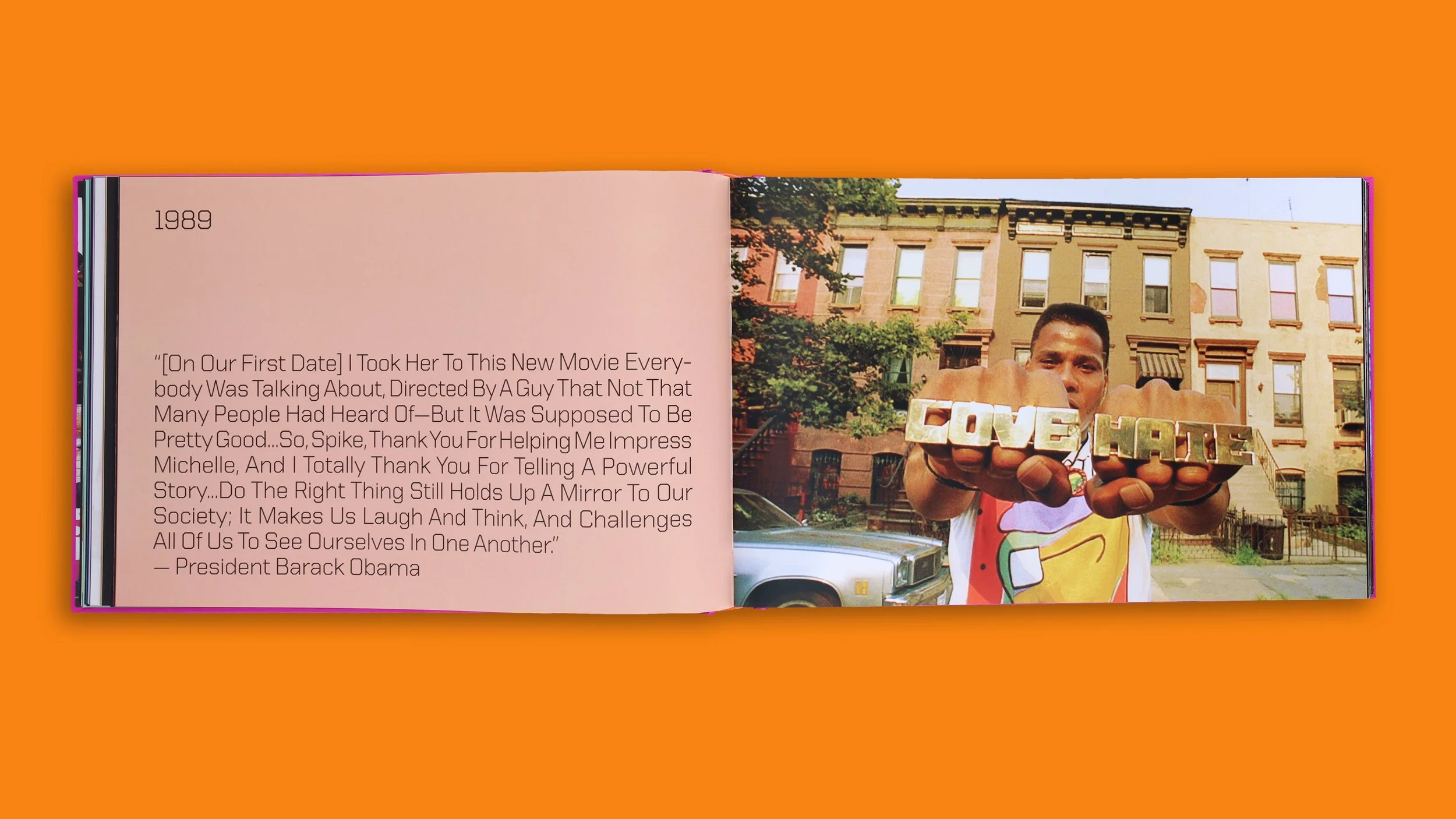
Once you flip past the bright and bold chapter title spreads, you arrive at a more subtle introductory spread. The first page of these spreads was designed to highlight Spike's experiences with specific films, as well as the experiences of others, President Barack Obama, for example. ¶ The first page of this spread uses a more subdued color palette for easy reading. These pastel-ish colors were chosen based on the background color of the corresponding chapter title spread, as well as the palette of the photograph it was placed next to. ¶ The second-page features full bleed images, most of which were taken by Spike's brother, David Lee, that gives readers a glimpse into what the chapter is about. ¶ As for the typography on these spreads, we wanted to make sure that there was some breathing room. With this in mind, depending on the size of the quote, a minimum and maximum font size were selected. This way, we did not have to limit how long or short a specific quote should be, nor would the impact of shorter quotes be minimized or lost to an otherwise blank page. 


VTC Spike Text & Italic
he quotes from these spreads, and the words on every other page were set in VTC Spike Text and Italic. Keeping up with the system established by VTC Spike Headline and VTC Spike Spine, these text [type]faces also have no curves. ¶ However, unlike the previously noted type designs, these two were based on my previously released VTC Du Bois. 


Chapter Contents
For the remaining pages within these chapters, I wanted them to resemble the cinematic experience from the audience's perspective. As the lights go dark and the film begins to start, you're immediately consumed by the lights of the big screen. It is this moment that I wanted to convey when I decided to make the background of almost every page black. ¶ As you flip through this monograph, you may notice a few white pages occasionally. This was our way of preserving the images with these beautiful burnt edges. ¶ Next, several full bleed pages were placed throughout each chapter, allowing some of the most iconic images from Spike's films to shine. ¶ Lastly, all of the captions for these images were placed near the gutter, giving the viewer some breathing room as they transition between the pages. 


VTC Spike Tag
This is the typeface you'll see the most and, possibly, notice the least throughout this monograph. VTC Spike Text and Italic are heavily refined versions of VTC Du Bois. 


Barnes & Noble Exclusive
Spike comes from an extremely talented family. His father was a musician who crafted the scores for several of his films. His sister also acted in his films. One of his brothers, David Lee, photographed almost every image within this monograph. That left Shadow, the graffiti artist in the family who passed way before his time. Without copying his work, I designed this graffiti-inspired sticker sheet, available with every copy of SPIKE purchased through Barnes & Noble.

Since the Release
Please note that throughout this process, the publisher worked directly with Spike while relaying his likes and (few) dislikes to me. I did not work with Spike directly. ¶ However, a week or two before the release, I got a call early one Saturday morning. I pick up with the understanding that telemarketers don't call this early. The caller said, "Hey Tré, it's Spike Lee, how you doin'?" The next day, he took a train down to DC to meet with me over lunch, and we've been working together ever since (four projects to date). He even gave my parents and me a tour of his studio (it's an experience). ¶ Before I discuss the book's success, I must point out that this is the first book I have ever designed. 

Now, enough about me. Since the book's release, Spike has done several book signings and signed several thousand books. He's gone on the Trevor Noah show to speak about the book and has even been photographed with several celebrities holding the book. 

Spike Lee and Trevor Noah holding the SPIKE book.

Spike Lee and Terry Crews holding the SPIKE book.

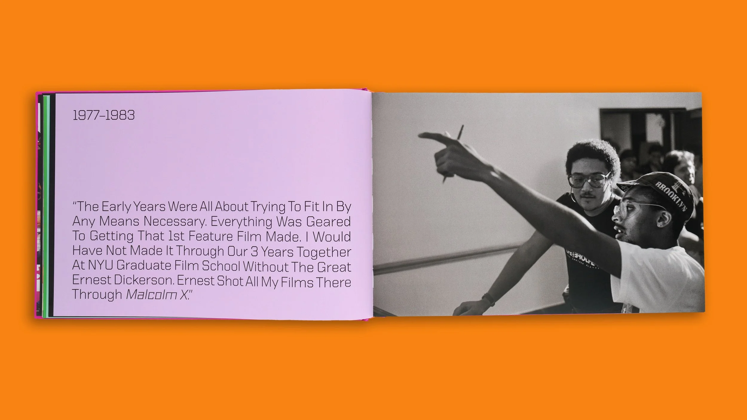
Ernest Dickerson pointing to himself in the SPIKE book
-
Partner(s)
Art Director: Steve Crist
Publisher: Chronicle Chroma
Author: Spike Lee
Photography: David Lee -
Timeline
Start: 10.2020
End: 06.2021
Launch: 11.2022 -
Service(s)
Concept Development
Editorial Design
Lettering
Type Design -
Note(s)
Featured in Creative Review, Curbed, Fast Company, Los Angeles Sentinel, New York Daily News,, Print Magazine, Rolling Stone, Today Show,