Charles Blow × Harper Collins
Charles Blow, a renowned columnist, journalist, and New York Times bestselling author, initially resisted writing a book on race. However, the increasing violence against Black people, both physical and psychological, and the events of the summer of 2020 prompted him to write The Devil You Know. This book proposes a new narrative for Black Americans, reflecting on the legacy of the Great Migration, where 6 million Black Americans moved from the Jim Crow South to the North and West during the 20th century. Blow argues that the perceived benefits of this migration have largely failed, as Black Americans still face severe oppression, including police brutality, housing discrimination, and political disenfranchisement in their new locations. ¶ Blow’s solution is a reverse migration, encouraging Black Americans to move back to the South. He believes that by relocating in significant numbers, Black Americans could form a racial majority in various Southern states, thereby creating a “contiguous band of Black power” that would dramatically increase their political influence and challenge the existing power structures. Blow himself has made this move, relocating from New York to Atlanta, and urges others to follow suit to transform America's political landscape and achieve greater racial equity. 
Wikimedia Commons
Behind the Design
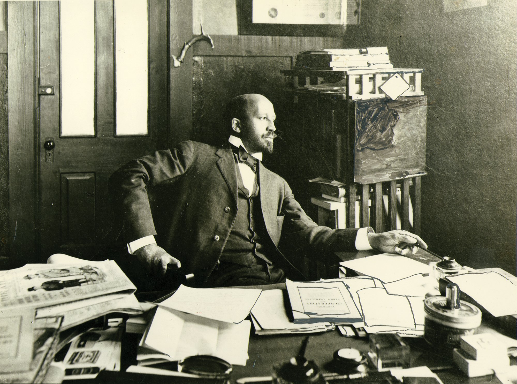
Harper Collins reached out via Vocal Type in September 2020, as Blow insisted on hiring a Black designer to work on the cover. After accepting the task and reviewing a 22-page draft of the book, I knew immediately what had to be done. ¶ Some months prior to receiving the opportunity, I had begun working on two very different font families. ¶ One was VTC Du Bois. Named after the pioneering African American sociologist, historian, and civil rights activist known for his profound contributions to the understanding of race and social justice in America. As a co-founder of the NAACP and the author of influential works such as "The Souls of Black Folk," Du Bois was a leading intellectual voice against racial discrimination. 
W.E.B Du Bois Collection, Special Collections and University Archives, UMass Amherst Libraries
At the 1900 Paris Exposition, Du Bois showcased a series of groundbreaking infographics that vividly illustrated the socioeconomic conditions of African Americans post-Reconstruction. These innovative visualizations, part of the "Exhibit of American Negroes," used charts, graphs, and maps to present data on education, income, and population distribution, effectively challenging prevailing stereotypes and demonstrating the progress and resilience of Black communities despite systemic oppression. Du Bois's work at the exposition not only highlighted the achievements of African Americans but also underscored the potential of data-driven advocacy in the fight for racial equality. It is from these infographics that VTC Du Bois was crafted. 
Library of Congress
Library of Congress
Library of Congress
Library of Congress
While working on VTC Du Bois, I was also developing another project. This font family is a revival of the typeface originally known as “Jim Crow,” which was a re-casting of an 1850s typeface called Gothic Shade. ¶ The typeface "Jim Crow" references more than just its name; it evokes a problematic history rooted in a 19th-century minstrel character created by Thomas D. Rice. Dressed in rags and blackface, Rice's portrayal popularized damaging stereotypes of African Americans as lazy and untrustworthy. These perceptions fueled the Jim Crow laws, which enforced racial segregation in the Southern United States from the late 19th century until 1965, mandating separate public facilities for white and Black people and dismantling Reconstruction-era progress.
This is a hi-res recreation of the original specimen using VTC Ruby. Unfortunately, the original Flickr account from which this reference was sourced is now gone. However, you can view the original reference on the Vocal Type site.
Through Vocal Type, the typeface previously known as “Jim Crow” has been redesigned and renamed VTC Ruby. This new name honors Ruby Bridges, who became a civil rights icon at six years old when she integrated an all-white school on November 14, 1960. Her act of courage marked a significant step in the fight against school segregation following the Supreme Court's landmark 1954 decision in Brown v. Board of Education, which declared segregated schools unconstitutional. Despite resistance, Ruby's bravery symbolized the push for desegregation in the U.S. education system. 
Wikimedia Commons
While VTC Du Bois and VTC Ruby made up two-thirds of the puzzle, it was time to find a reference for the color palette that was just as impactful as the typography. In comes James Baldwin’s The Fire Next Time. This powerful exploration of racial tensions in America is composed of two essays that address the country’s systemic racism and the urgent need for social change. Published in 1963, Baldwin's work provides a personal and prophetic critique of the ongoing struggle for civil rights, emphasizing both the historical roots and contemporary realities of racial inequality. Sound familiar? 
Once these three references came together, I only had to experiment with four layouts. Naturally, the layout that more closely resembled The Fire Next Time was selected.
Since the Release
Since the book's release, Blow has done countless interviews on TV, over Zoom, and in person, including appearances on Late Night with Stephen Colbert, MSNBC, and CNN, interviews with Darren Walker (president of the Ford Foundation) and Henry Louis Gates, Jr., and more. Most recently, Blow has also released an HBO documentary called South To Black Power based on this book.
-
Partner(s)
Harper Collins
-
Timeline
Launch: 01.2021
-
Service(s)
Editorial
Typography -
Note(s)
See on CNN, Daily Mail, MSNBC, and NPR.


