Kamala Harris for President
As someone who supports underrepresented cultures and liberation movements, I couldn’t help but support the campaign of a candidate who could have been the first woman president, the first Asian-American president, and the second African-American president. When the request came to customize VTC Tatsuro for Vice President Kamala Harris’s presidential campaign, the opportunity to contribute to such a historic moment felt deeply meaningful.
Alamy Photo
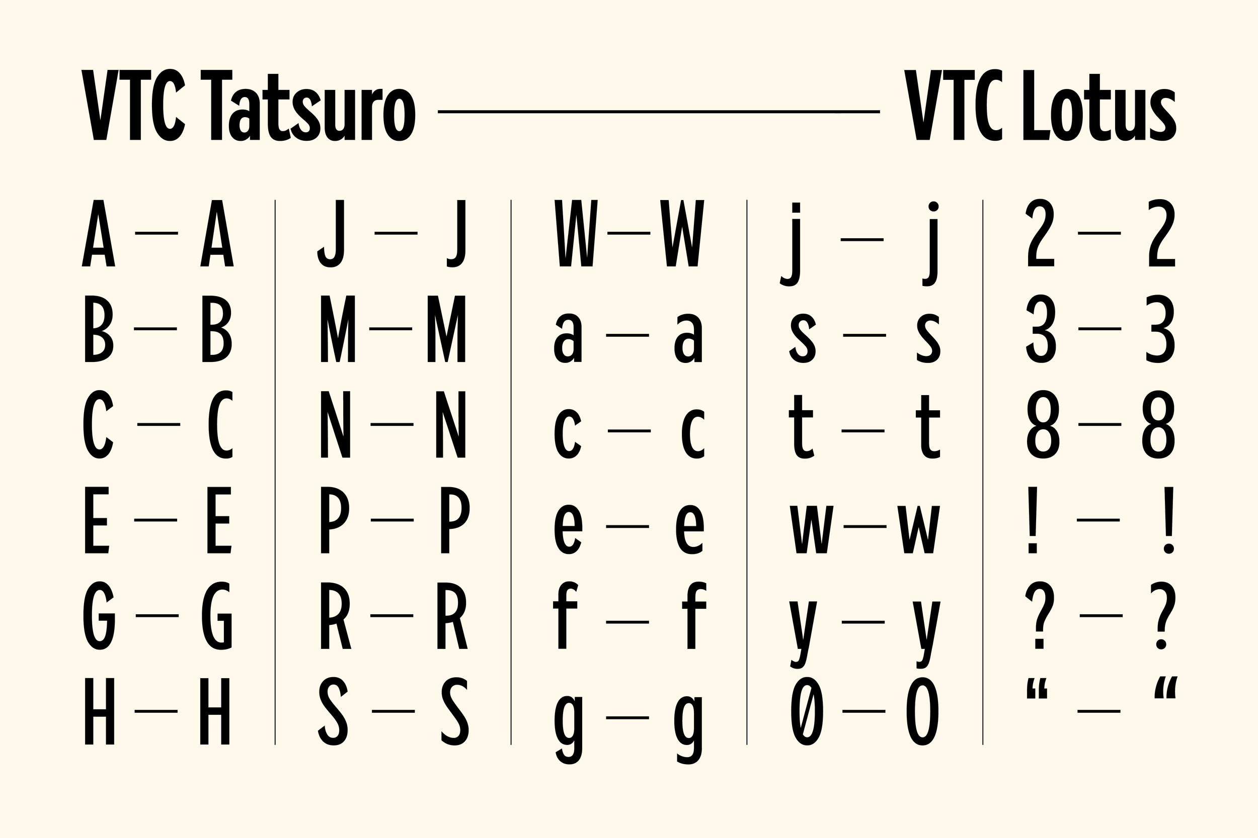
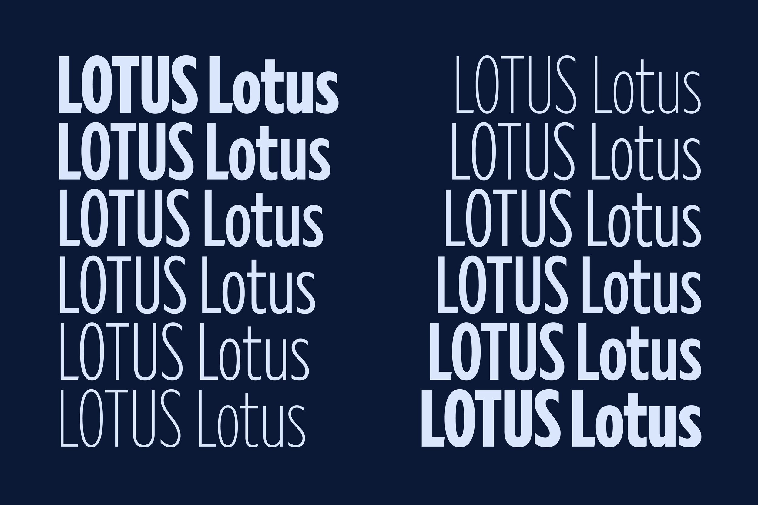
The project came with an incredibly tight deadline—just 24 hours to complete the font family. My team and I jumped in immediately, working to adjust VTC Tatsuro and create a custom font family that felt not only fitting but impactful for the campaign’s visual identity. VTC Lotus, the evolved version of VTC Tatsuro, draws its inspiration from both the history of Japanese-American symbolism and a powerful moment in American history—the "I AM AN AMERICAN" sign that was displayed in Oakland, California, right after the attack on Pearl Harbor in 1941. This design is further enriched by the connection to Vice President Harris’s roots, as she was born just miles from where this iconic sign once stood.
National Archives
The typeface pays tribute to the lotus flower, or hasu, a symbol of enlightenment, resilience, and mental purity in Japanese culture. Kamala, her first name, also means lotus in Sanskrit, representing purity and strength—values embodied by the vice president’s journey. The redesigned font family reflects this resilience, offering a more open and balanced design while staying rooted in its historical influences. Even with the tight deadline, we managed to add a lotus icon to the font, which was a final touch before submitting the project.
Once the typeface was complete, we also had to create a wordmark featuring VTC Lotus, along with our type pairing recommendations. The final design features VTC Lotus for "HARRIS," a customized version of Jubilat for “for,” and VTC We for "PRESIDENT."
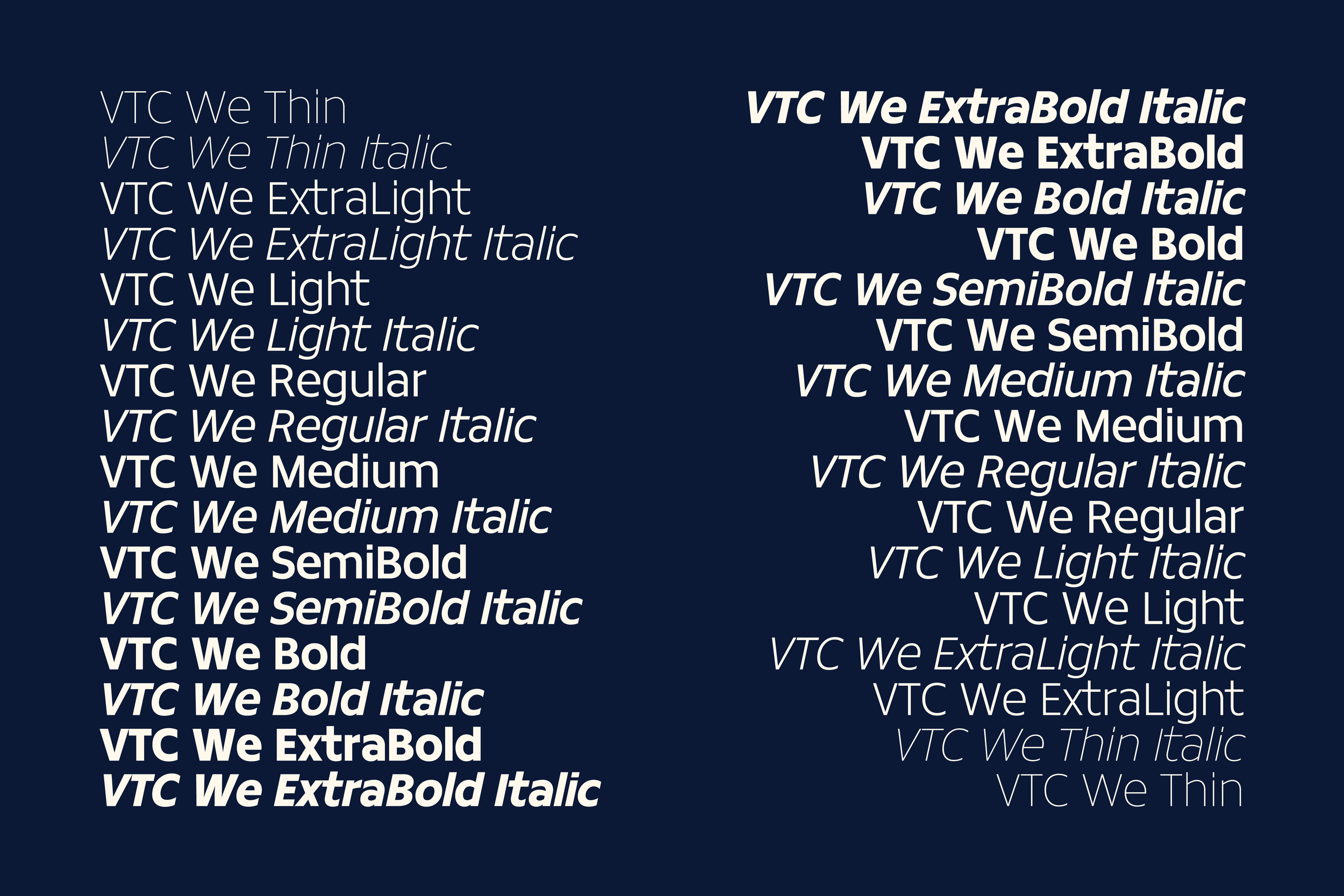
While you already know the story of VTC Lotus, the word “for” in our wordmark is set in a modified version of Jubilat SemiBold Italic, part of a font family designed by Joshua Darden, the first Black type designer in recorded history. ¶ For “PRESIDENT,” we used VTC We, an in-progress font family inspired by one style of lettering found on the signs and banners of fifteen protest movements across six decades and five countries. 
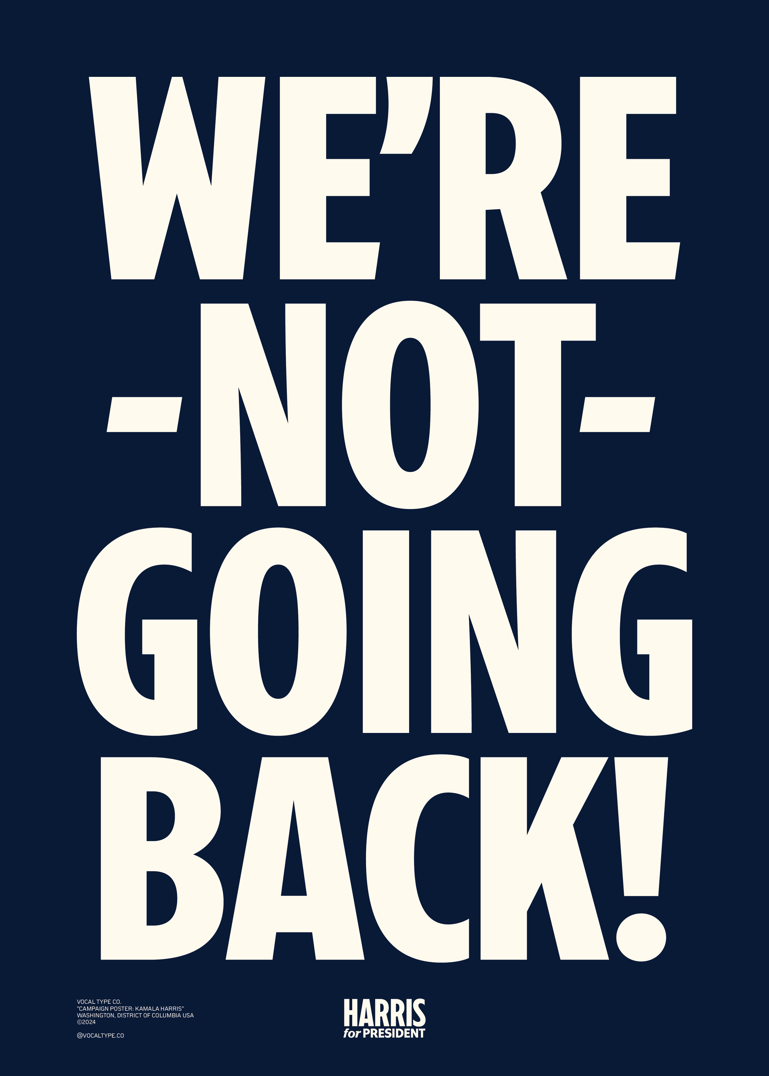
Lastly, we loved VTC Lotus so much that we made a poster.

-
Partner(s)
Type Designer: Tré Seals of Vocal Type
Type Designer: Michele Patàne of Cinetype
Studio: Wide Eye
Creative Director: Ben Ostrower
Senior Designer: Sebastian Arredondo -
Timeline
Start: 07.31.2024
End: 08.01.2024
Launch: N/A -
Service(s)
Identity
Typography -
Note(s)
N/A


